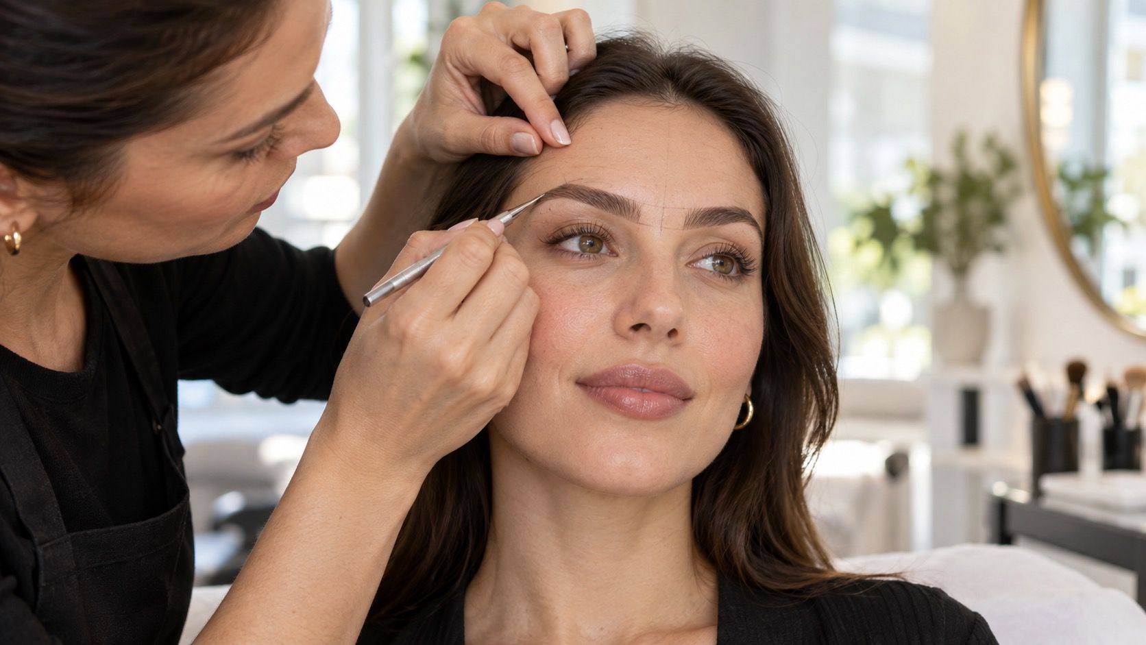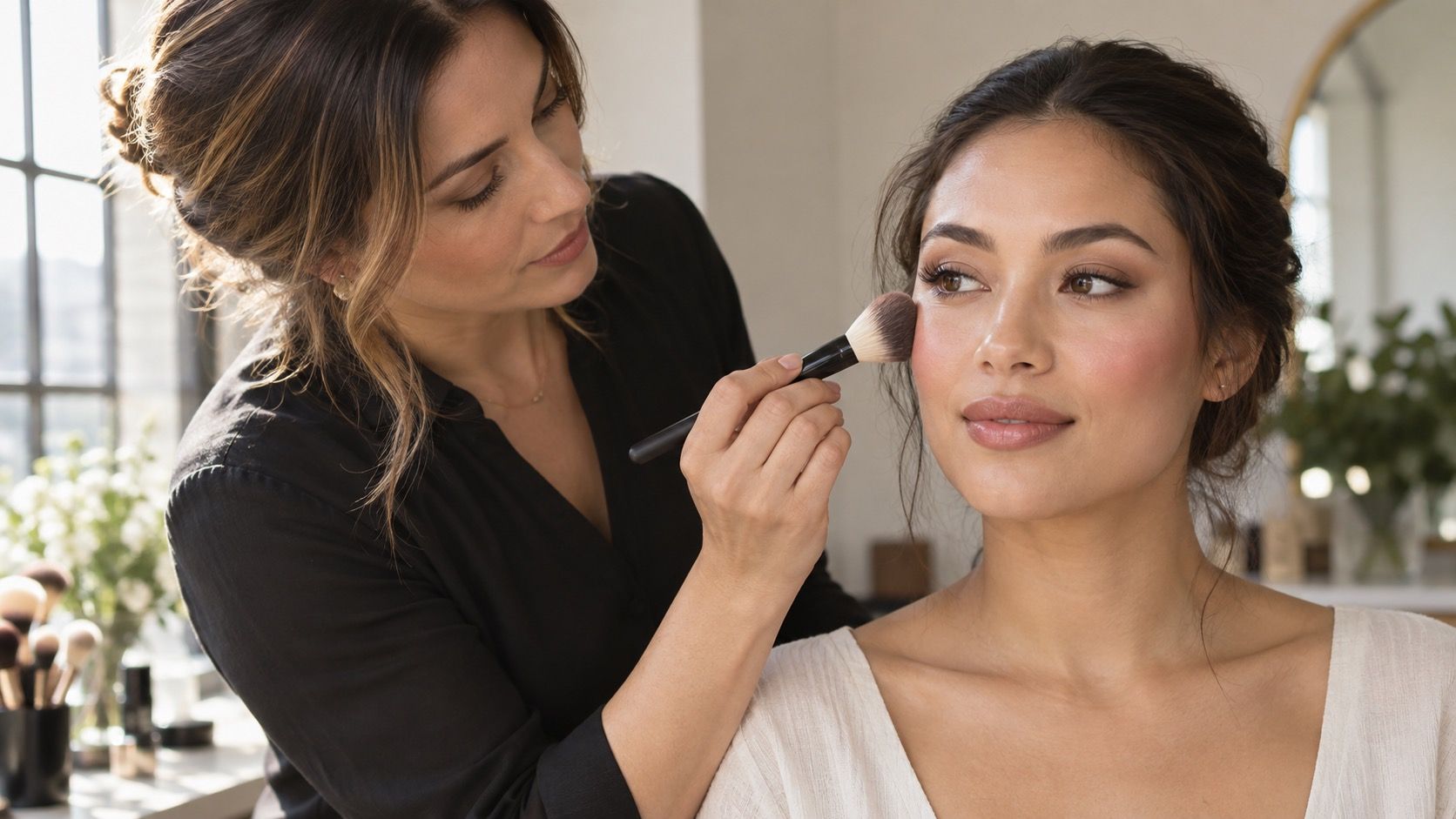
Face shape makeup is most useful when it treats contour, blush, and highlight as small adjustments to light rather than an attempt to redraw a face. The camera-friendly maps often use strong stripes and identical placement for everyone. In daylight, that approach can look heavy fast. Start with your own bone structure, apply less than you think, and decide what you want to emphasise before choosing a technique.
Use makeup as optional visual placement, not correction
A round face does not need to be made angular, and a square jaw does not need to disappear. Makeup can add definition where features already exist or soften a transition you find distracting, but it should not require a different face every morning. Think in terms of attention: blush brings warmth and focus, highlight catches light, and contour creates a gentle receding effect when it is blended well.
Find your natural cheekbone before placing blush
Begin with a sheer base and inspect the face before adding sculpting products. Notice the natural shadows below the cheekbones, at the temples, and around the sides of the nose. Those shadows move when you smile and speak; a stamped contour line does not. A cream formula often gives beginners more time to blend, while powder can be easier over a set base. Either works when the shade is subtle and the application is light.
Instead of following a diagram, locate the top of your cheekbone by feeling gently from the ear toward the outer eye. The soft hollow below it is where contour may sit; the higher, rounded area is where blush usually looks most alive. Keep the two products separate. When dark contour rises too close to the eye and blush drops too low, the middle of the face can look muddy rather than sculpted.
Blush placement for face shape can shift the apparent direction of the face. Applied on the apples and blended outward, it creates a soft, youthful centre. Placed slightly higher and swept toward the temple, it gives more lift and draws the eye upward. Neither placement is superior. Try each on a bare-skin day using the same blush colour, then check it in a window rather than under a bright vanity lamp.
| Face proportion | Blush starting point | Contour approach to test |
|---|---|---|
| Round | Outer cheek, blending up toward the temple | Softly under the cheekbone; avoid a hard diagonal stripe |
| Long or oblong | More horizontal placement across the cheek | Light temple or hairline shading only if wanted |
| Square | High, rounded colour over the cheek | Diffuse around jaw corners rather than drawing a new edge |
| Heart or triangle | Balance the upper and lower face with a soft outer sweep | Use only where a natural shadow already appears |
Contour ideas by face shape that stay believable
For a round face, a small amount of shadow under the outer cheekbone can create definition, especially when it fades before reaching the mouth. Extending it too far inward is a common mistake; it turns a soft face into two obvious brown brackets. A little contour at the temple may be enough if you want more structure, but it is optional and should disappear into the hairline.
For a long face, the goal is often to avoid adding more vertical emphasis. Gentle colour at the hairline and a more horizontal blush placement can make the proportions feel quieter. Square faces can use a soft wash around the outer forehead and jaw corners, but sharp contour placed exactly along a strong jaw tends to outline it rather than soften it. On heart and triangle faces, restraint around the jaw and forehead usually works better than trying to make both ends identical.
Highlight should follow light, not social-media geometry
Highlight belongs on places that naturally catch light: the top of the cheekbone, a small point above the outer brow, or the centre of the eyelid. High-shine product down the whole nose bridge can look striking in a close photograph, yet it may make texture more visible in daylight. If your skin is textured or you wear glasses, a satin formula gives a softer effect than glittery powder.
Watch where the highlight ends. A bright stripe carried too close to the eye can compete with concealer and make makeup look separated into zones. Press a tiny amount on with a fingertip, then step away from the mirror. If you can identify the exact boundary from arm’s length, blend again. Good makeup has a way of looking obvious only after it has been removed.
Choose products and tools for the finish you can maintain
Cream contour and blush can melt into a dewy base, but they ask for a quick hand and may move if layered over a very slippery sunscreen. Powder products last well and are easy to build gradually, though they can catch on dry patches. A small dense brush offers control for contour; a softer brush makes blush easier to diffuse. Tools are less important than using an amount that gives you time to correct the placement.
Colour matters as much as placement. A contour shade should read as a muted shadow, not a warm bronzer or an orange stripe. Bronzer is a separate choice for warmth and can sit where the sun would naturally reach. Test products on the cheek or jaw in daylight when possible. Store lighting makes many tones look more neutral than they are outside.
Check the result in daylight and ordinary movement
Before leaving, look at both sides of the face from several angles near a window. Do not chase identical symmetry: faces are not symmetrical and makeup shifts as you smile. Instead, check whether the overall colour appears balanced and whether the contour disappears into the skin. A quick phone video in natural light is often more honest than a still image because it shows where product catches or sits flat.
The most effective contour for face shape is the amount that still lets your expression lead. Keep a note of placements that feel good under your usual lighting, and adapt them for a short day, an evening event, or a photo. You are not required to contour at all; blush and a little strategic highlight may already provide everything you want.